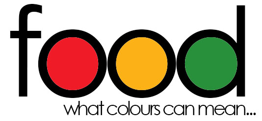
 We are all aware colour can really brighten up labels and draw attention to the product. But are you using colours to the best of their abilities? Readily recognized colour schemes such as the traffic lights are just one way designers can use color to heighten message impact and minimize verbiage on labels where space is scarce. The traffic light system is used to display nutritional information. In nutritional terms, red is bad, yellow is middle-ground, and green is good. Everything from fat to salt content is displayed in this way. So when designing your labels think about the message you want to portray, and the way you would like to deliver this to consumers.