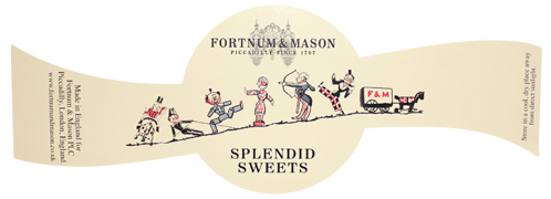
Do you think this less-is-more concept applies to your product(s)? Think about the colours, content and the design of your labels. Would fewer colours or even just a plain black-and-white label make your product stand out against other competitors? Would a simple, bold design make the product more memorable than other all singing and dancing competitors? When designing your label, remember to think about how will your colour scheme impact the labels printing prices and turnaround? What essential content must be included in the labels content, either for regulatory compliance or in the interest of full disclosures to consumers? Generating a multitude of ideas will help you decide on what look is right for your label. There are no right or wrong answers. It’s a matter of how to stand out against your competitors. The picture above is perfect example of how less can be more with a few innovative ideas. For more details contact Etiquette on 0845 222 0354 or you can email the Sales Team at: sales@etiquette.co.uk