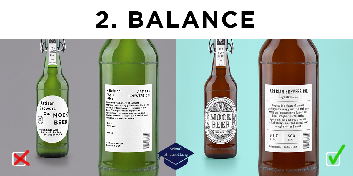
Balance is crucial in any type of design – from furniture to websites, from a beer bottle label to a sports car.
In this paragraph, we want to cover the basic concept of composing your label with a balance in mind.
This is an intro to an interesting article by Shutterstock, describing quite well why balance is important: “Humans naturally seek out symmetry and, according to Gestalt psychology, we tend to perceive objects as symmetrical shapes that form around a centre point. That’s why balance is one of the key principles of design. Visual balance is essential because it provides a sense of unity, order, and equilibrium. Your design needs to visually “hold together” in order to feel complete and harmonious.
But to be clear, balance doesn’t mean everything should be perfectly symmetrical. It just means that the visual weight of objects, space, and colour is equally distributed across the page. Without balance, a design feels off-kilter, inconsistent, and unsettling. ”
There are many ways to achieve balance. It is not the same as symmetry, although using symmetry is often the easiest way to achieve balance.
“Asymmetrical balance creates tension through contrast and is much more visually interesting. Because it’s abstract, there is no symmetry; there are no perfect mirror images. Instead, you’re arranging elements of all different visual weights in such a way that each side is still balanced out. The “heavier” elements will jump forward and catch the eye more than the “lighter” ones, which will recede.
Large items seem heavier than small ones. Dark items feel heavier than light items. Warm, bright colours are more eye-catching than cool or neutral, muted ones. Red is considered to be the “heaviest” and yellow is the “lightest.” Objects with texture appear three-dimensional and feel physically heavier than objects without texture. A few small objects can balance out a single large object. “
There is also a matter of using negative space but I think it is a topic for a separate article.
We realize of course – it’s easier said than done. If you need advise on a label design or help designing it from scratch – we’re here to help! Give us a call on 01978 664544 or email sales@etiquette.co.uk.
The rest of the articles in the School of Labelling: