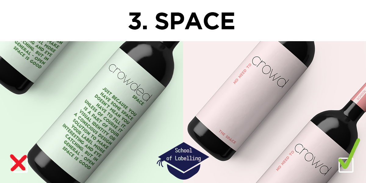
Do you know that feeling you get while travelling on a bus full of people or trying to swim in a crowded swimming pool? When you try very hard to pretend that you’re comfortable but you’re really, really not?
Well, in my opinion, some labels look like the elements are uncomfortably close to each other. Space is good.
Depending on what type of label you are designing, the rules will change. If it’s a warning label or list of ingredients – the aesthetic aspect will play a smaller part. If it’s the main product label – for more important. You might be tempted to use all the space to give your customer all sorts of information – from the opening times of your business to the source of your organic papaya smoothie. The label is not necessarily the best place for that.
If you haven’t seen our previous posts about fonts and balance, read those first!
Here are a few pointers, on how to avoid the most common mistakes:
- Try to limit the information to the absolute essentials and design a rough version of your label. Then if you think you can add a bit more – go ahead.
- Less is more. Just because you have a great logo or a beautiful image it doesn’t mean it has to take up all the free space. Just think about Apple products – the apple logo on the back of a MacBook has a lot of room around it, it’s not huge – you still notice it just the same. Leave some room to let it breathe.
- Group your information. Try to see how you can position them. Maybe placing them in a different order will create more room? Can you make them smaller or bigger? Sometimes it helps to print the text out to see how it will look like.
- Improve legibility. Check font size, the spacing between the lines and between letters (leading, kerning and tracking).
- Think of whitespace as an element on its own. Use it to create order, flow, grids and hierarchy. The more space there is between elements, the easier it will be to treat them separately
- You can very often have to little empty space within your design. You rarely hear about to much empty space!
There is still plenty to be said, so if you’re interested – visit this blog post by Vanseo design and look at some designs on Pinterest for inspiration.
If you don’t think this is something you’ll be able to handle – please remember that we can help you out with any labelling issues, including design. Give us a call on 01978 664544 or email sales@etiquette.co.uk.
The rest of the articles in the School of Labelling: