We usually can easily and fairly quickly distinguish between high and low-quality products. From cheap socks and toys to tech gadgets and cars – we know what to expect from a product by the way it is presented to us. It might not be always beneficial, but we do judge a book by it’s cover!
That’s why when designing a label, you have to imagine it on the product, and on the shelf. The competition is fierce.
There are several aspects of quality in the design you can analyze, that will help you to achieve to best results:
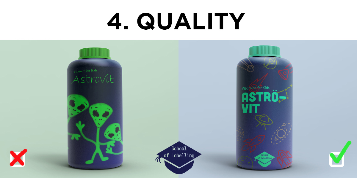
- Quality illustration/images. This might sound a bit obvious but… use good images. If you are unsure what images are good – do a bit of research, talk to potential customers about it, check what your competition is up to. Does your illustration/image stand out? Is it aesthetically pleasing? is it original? Is it in harmony with your brand/logo? (We’ll discuss logo itself in a separate article) The image above is an exaggerated example of this dilemma. Whilst the funny-looking aliens are not a bad idea in itself – the level of skill used here is clearly very low, there is little attention to the background and overall impression is that the product isn’t very good. The other label has been composed using free elements and free fonts (I rely on Google fonts and Graphic Burger a lot) but you can get ready to use graphical elements in very reasonable prices from many online creative markets.
- Quality font. We have discussed how font matters in another post (please have a look) but we have not mentioned font pairing – it’s another thing to tackle. The simple solution is to use one type of font, just use different weights or caps to keep the design visually more dynamic. Test different font side by side before you make your final decision. You can also use the pairings suggested by Google fonts.
- Image resolution. Image resolution is the detail an image holds. Higher resolution means more image detail. If you are unfamiliar with this topic – it’s probably something worth looking into. It simply means that you can take a small picture and make it large by stretching it. If you are using a low-resolution image it can ruin the label no matter how beautiful it is. It will be pixelated and will look very unprofessional and amateur.
- Quality of print. If you’re planning on printing the labels yourself use good quality paper and check your printer settings are set to the highest quality print available. Depending on the quantities of labels required you might want to get in touch with a reliable label printing company. In general, you can choose digital labels for smaller quantities and flexoprinting for large runs. They have higher origination cost but are cheaper long term.
There is plenty more to say, but following those 4 basic rules will undoubtedly improve your design.
If you are having doubts about it and would like a professional expertise, you can contact us here at Etiquette on 01978 664544 or email sales@etiquette.co.uk.
The rest of the articles in the School of Labelling: